THE PROCESS
When I started working on the branding I did some sketches on paper, tried different colours and different concepts. I looked Scottish prehistoric sites pictures for inspiration and brainstormed different ideas. The ones I liked the most and thought could turn into something nice, I digitized them.
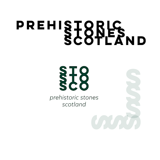
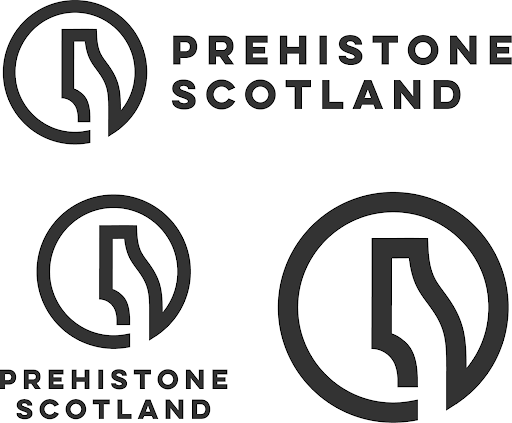
I was struggling to decide with the name at first and I wasn’t sure whether I wanted the logo to be very direct or quite abstract and conceptual. While the logotype on the left is very straightforward, as I want this project to be as modern, engaging and inclusive as possible, I decided to go for a more conceptual logo.
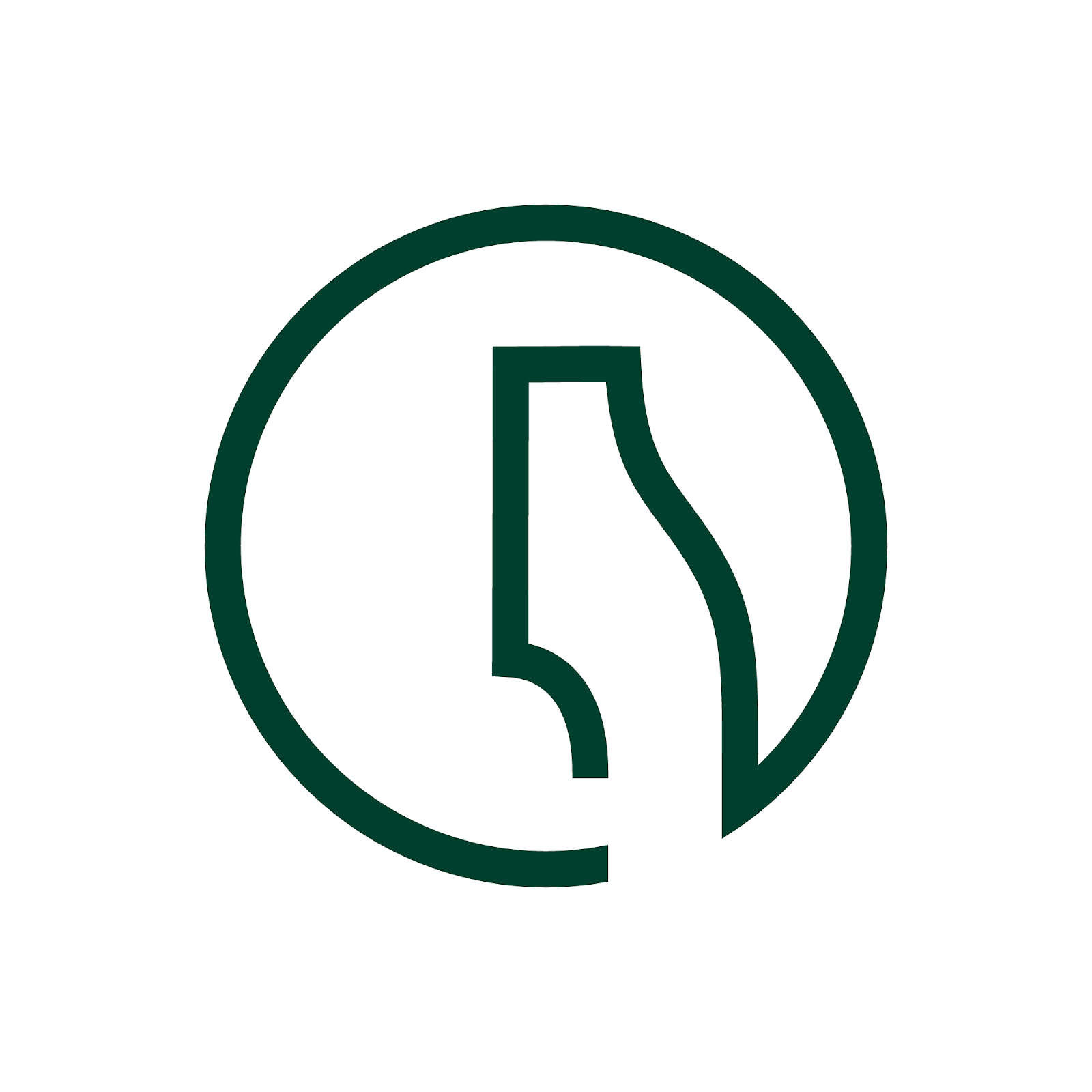
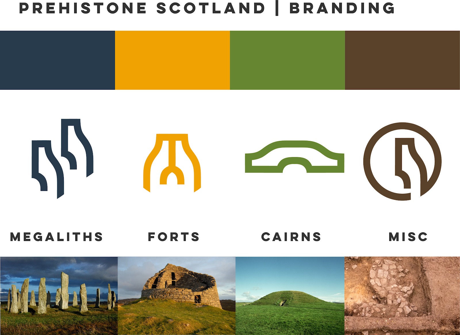
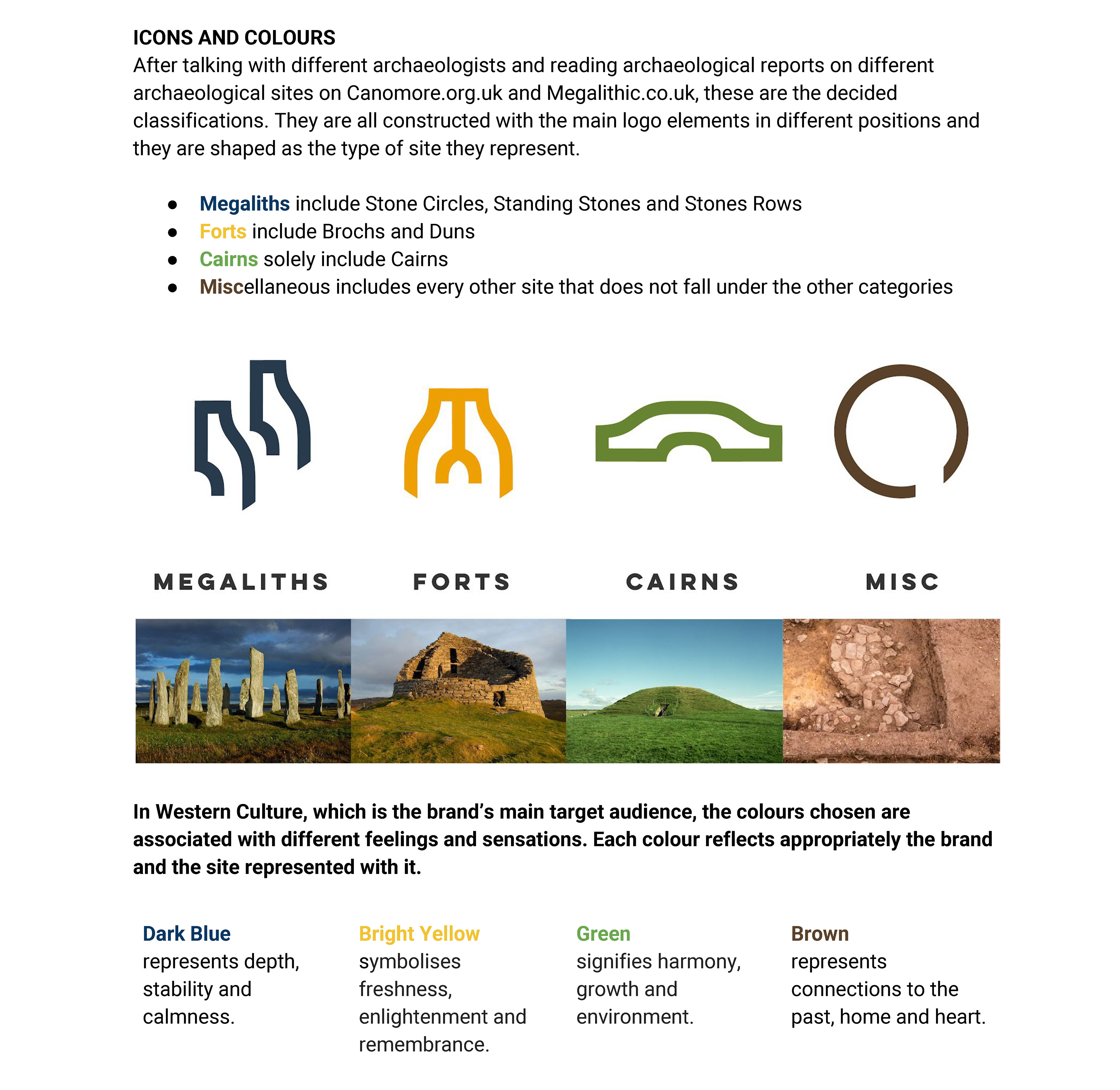
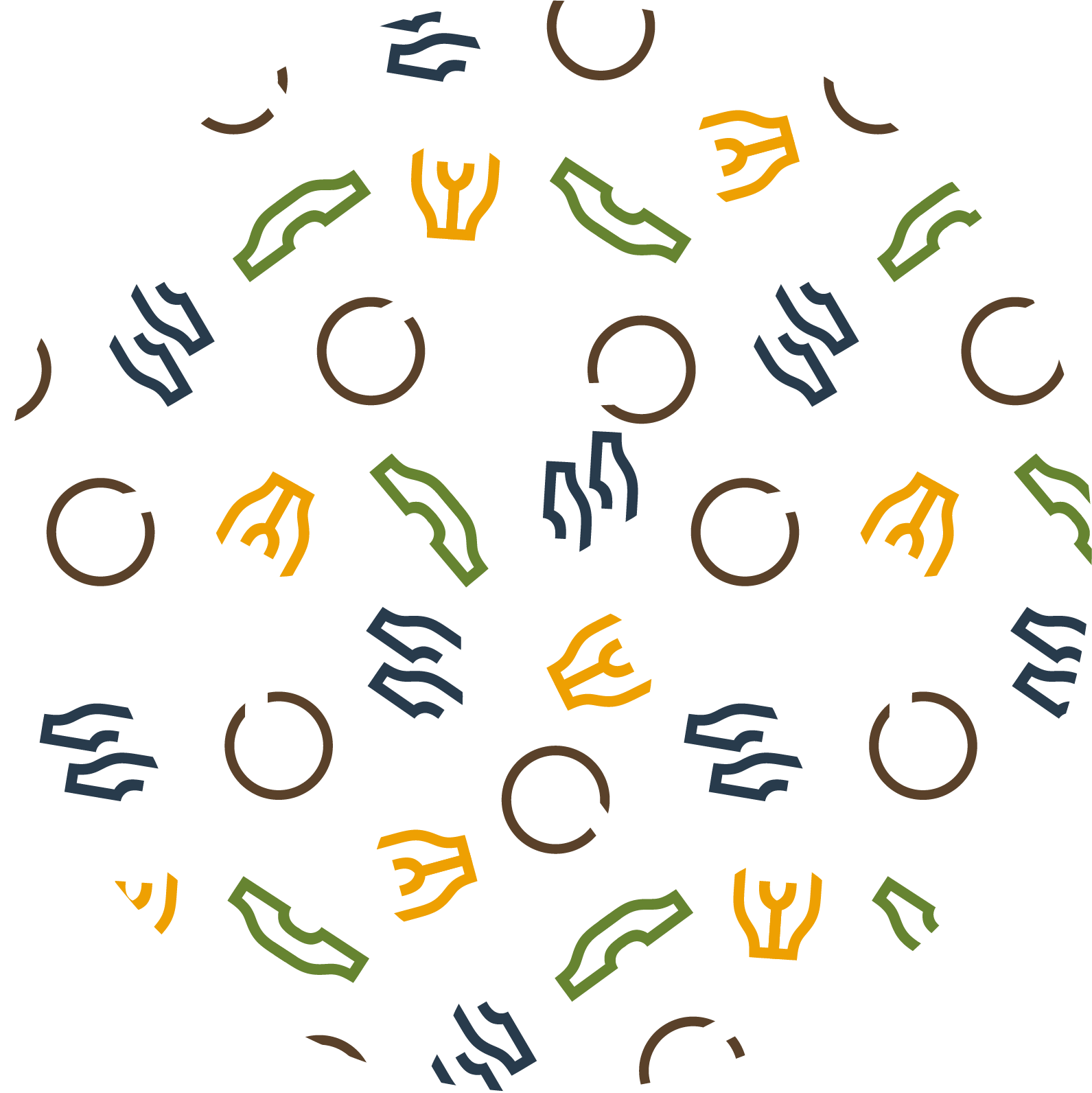
The circle represents History (a line that goes backwards, anticlockwise) and the gap in the circle signifies the absence of written documents that defines Prehistory which differentiates it from History. The object inside the circle represents the stone, material preserved to the modern day from ancient times. The shape of the stone is inspired by actual standing stones in Scotland (Calanais Stones, perhaps the most popular site).
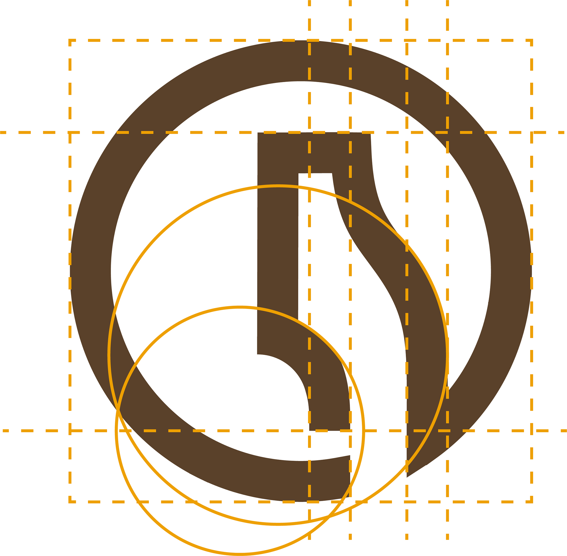
This shape is also versatile since when copied and reflected it looks like a broch, when duplicated it represents multiple megaliths and when rotated, copied and reflected it looks like a cairn (as shown in the picture below).
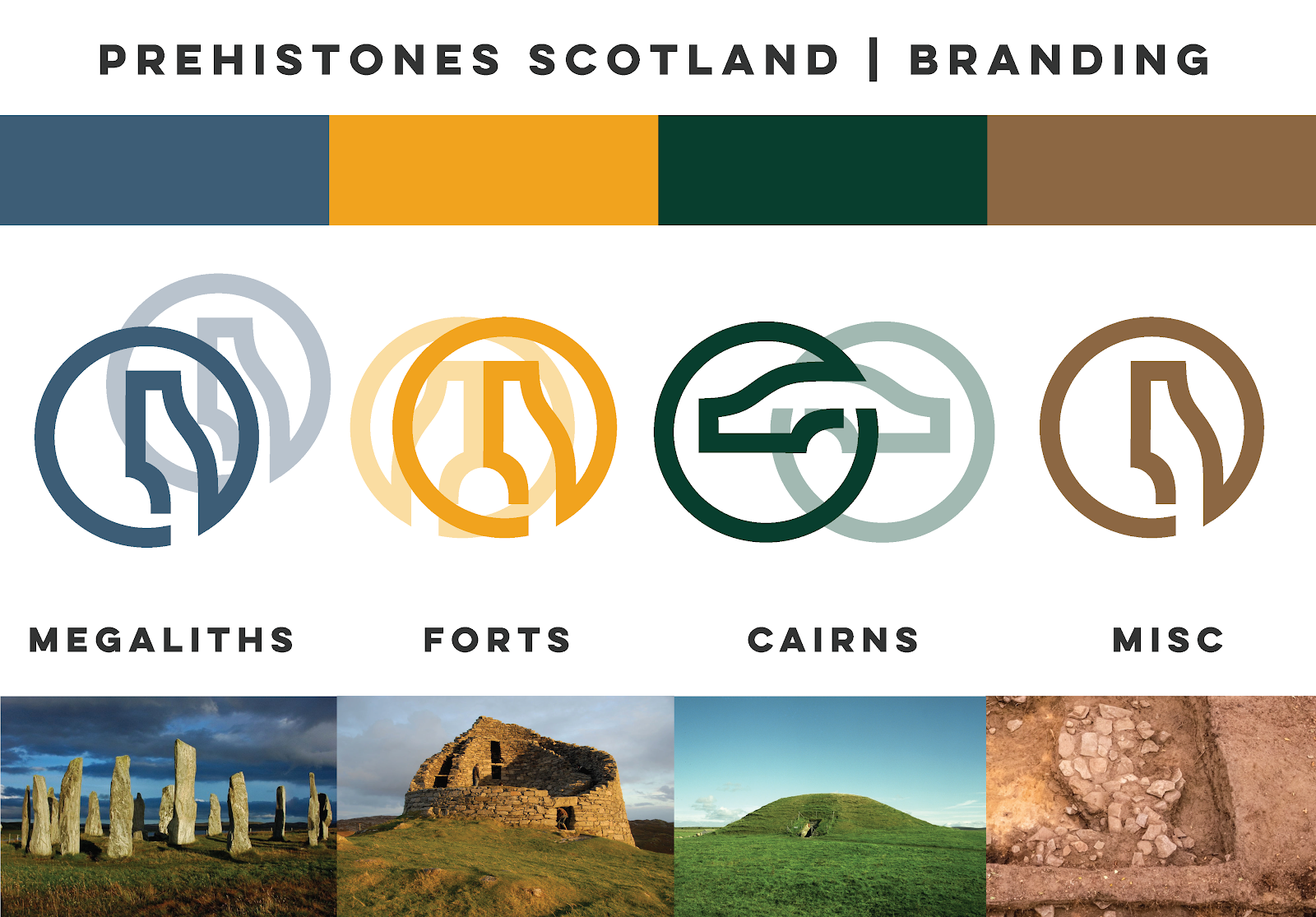
I talked to Staci, a professional graphic designer, for some feedback and adjusted colours and icons. I was getting a little stubborn with preserving the main logo and making it work for the different types of monuments. Staci suggested to make it easier for the eye and develop the icons based on the main logo like I wanted to do but without interlaced circles. She also suggested to contrast more the colours.
Deciding on a name was not an easy task. I had to keep in mind various aspects of the brand. Who was it for, what feelings it is supposed to evoke and, finally, it needs to sound right. The brainstorming for names included:
Just a bunch of stones
A bunch of stones
Stones constellation scotland
Before and beneath
Ask the stones
Clachs of scotland
Alba clachs (Stones of Scotland)
Stones from the past
Gems from the past
The stones before us
Before history scotland
Prehistoric scotland
Prehistoric Stones
Prehistones
The stones among us
The stones between us
Prehistones sounded the best and it was the most original of all. Prehistory + Stones, it had it all but needed one more word to be more identifiable: the word Scotland, as it is about Scottish sites. After talking to Staci, she noted that the two S in PrehistoneS and Scotland clashed phonetically, so I went for Prehistone Scotland.
As explained in the Online Marketing Document:
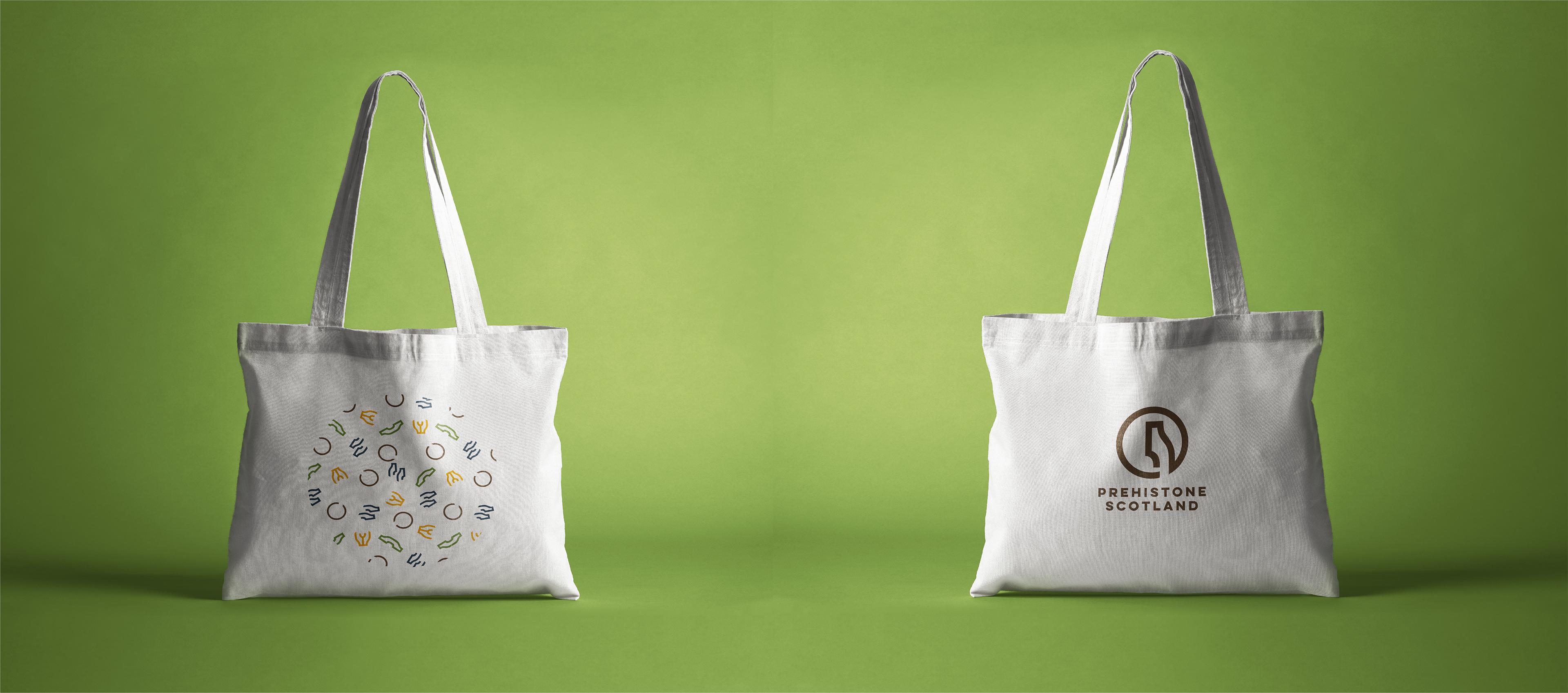
I added some patterns that can be used in future branding materials. An example is shown below: a fun tote bag.
As explained in the Online Marketing Document:
“Listen to our past” is the brand's tagline:
It invites the viewer to the world of prehistoric archaeology.
“Listen” is an invite to “you” the audience.
“Our past” because as Neil Oliver says “Scottish history belongs to everyone.” Referring the past as “our” conveys the feelings of inclusion and connection that this project aims to achieve.